 Live Chat
6 Industries in Need of Better UX Design

Bad UX repels customers.
Think about it — how many times have you struggled to make sense of a government webpage that looks like it was cobbled together in the late ’80s? How many hours have you spent fruitlessly trying to find a single piece of information on your health insurer’s mobile app?
Or have you ever tried to find a simple contact page on an artist or performer’s page, only to be foiled once again by overly avant-garde web design?
If you’ve dealt with even one of these experiences, you know that the sheer frustration they spark. In fact, some of them have the power to make you never want to approach the given brand or organization again. It’s an unavoidable truth: Poor design takes a business toll.
There are more than a few industries that need better UX. In this article, we’ll highlight a few of the worst offenders and provide some ideas of how they can improve.
Government
This one should come as no shock. If you’ve ever checked for your tax return status or needed to file paperwork with your local government, you’ve probably experienced the frustration that comes with attempting to navigate poorly designed, unappealing government websites firsthand.
Of course, we shouldn’t be too critical — after all, there are at least a few things that governments do well with site design.
According to a recent Forrester evaluation, government sites tend to be very good at defining information architecture for their websites; in other words, they organize their data and content in an accessible way. The clear structure of their navigational elements makes it easy for site visitors to track down the information they need. This is in sharp contrast with many private sector organizations, which often pad their sites with stylish design elements but include relatively little informative content.
For instance, the Social Security Administration puts the most critical categories of interest — disability, retirement, Medicare enrollment, and online services — under one consolidated section of their home page. Since most visitors who come to the site are interested in accomplishing a limited range of tasks, it makes sense to place the most-searched information foremost in the information hierarchy.
That said, government sites often cram an overwhelming amount of information onto a single page without clearly delineating between one topic and the next.
The recent COVID-19 crisis has highlighted just how difficult virtual interfacing with the government can be. In the span of a few weeks, millions of people attempted to file for unemployment, get their stimulus check directly deposited, or request small-business loans — and promptly reported confusion, frustration, and failure.
Poor site design confuses site visitors and ultimately places an even more significant burden on the government. No one wants to fill out onerous, confusing, multi-page applications, or refresh a crashed site in the vain hope that it will eventually load. Governments need to lean on UX design to maximize its ability to function during good times and bad.
Good site design shouldn’t stagger to a halt in a crisis. Canada’s digital presence provides a case study on government websites done well; recently, the Canada Revenue Agency (CRA) developed an online platform to provide aid for those who lost their job due to COVID-19. The pared-down site was geared toward an audience of varying technical proficiency levels and has since met near-universal praise by Canadians.
Here’s what you can do if you work in government.
The odds are good that if you work in a non-director, public-sector role, you probably don’t have too much say as far as how your department’s website looks. However, there are steps that you can take to help offset bad UX during current and future projects.
- Familiarize yourself with the systems at hand.
If you want to make a change, you need to know what should be changed — and that means adopting a consumer’s perspective. Take note of the most common complaints your office receives and use that feedback to find specific places where people seem to be getting lost and frustrated. Then, bring your notes (and, if you’re feeling ambitious, suggestions for any updates you believe should be made) to your supervisor. Who knows; your suggestions might set improvements into motion! - Make a habit of predicting common visitor questions.
Working on a new project? If so, the first step you take should be to figure out who the project benefits, what they want from it, and why. Once you have those answers, you should be able to organize your information in a way that helps visitors find what they are looking for quickly. - Bring a consumer-experience mindset to your office culture.
Sure, the work of one person probably won’t reverse the government’s decades-long reputation for subpar UX. But good UX habits need to start somewhere; why shouldn’t they come from you? By modeling your consumer-experience savviness at the office, you may be able to encourage others to do the same. Start a movement!
Additional Resources
- Official Usability & Web Site Guidelines of Governments From Around the World — UsabilityGeek
- Why is Usability Important for Local Government Websites? — Granicus
- Creating a User-Centered Approach in Government — Usability.gov
Utilities Providers
Utility companies are particularly pernicious offenders when it comes to poor UX design. How many times have you struggled to understand — or even find! — the statement for your electric bill online?
Too often, utility providers make tiny UX missteps that become collectively exhausting: think homepage links that are just a smidge too small or informational guides that aren’t quite as intuitive as they should be.
That said, electric companies’ websites can stand as a UX example in some ways — for one, they tend to be just as comprehensive and informative as government websites. However, for electric providers, that overload of information can often be detrimental rather than helpful
In a single geographic area, several utility companies offering virtually the same product need to compete for the same target groups. Consumers can choose their electricity provider — and for that reason, utility companies that don’t skimp on UX often attract and retain the most customers.
Consider Genesis, New Zealand’s leading energy retailer, as an example. The company invested in an analytics plan to better understand where their site failed. Then, after gathering data, the company made one small change: it placed a ‘Pricing Plans’ link front-and-center on the home page. This little shift resulted in a multimillion-dollar increase in revenue over three months.
UX matters, even if the product you sell is as necessary as electricity.
In fact, a 2018 McKinsey study on business design found that companies with top-quartile McKinsey Design Index scores outperformed industry benchmark growth by nearly two-to-one. These top-rankers experienced 32 percent higher revenue growth and 56 percent higher total return to stakeholder growth over five years compared to their lower-ranking competitors.
Here’s what you can do if you work in utilities.
At heart, utilities companies have the same consumer-facing prerogatives as any other business. Here are a few strategies you can deploy if you want to improve utility UX from within.
- Reiterate the importance of good UX in the utility sector.
As the above research demonstrates, all industries can benefit from good design, whether they currently understand it or not. Your employer may not even realize that they have an opportunity for growth! If you think UX is underutilized in your company, try submitting a proposal to your supervisor that outlines the potential gains to be had by prioritizing user experience. - Focus on the common frustrations.
What utility features trip up your consumers? Do they struggle to find their bills, or have trouble understanding the cost breakdowns they see there? Consider sending out user experience surveys to identify any frustration-causing flaws. You never know; a few small changes or an FAQ page could make a world of difference for customers! - Encourage a customer mindset.
Most people can’t opt out of their utilities in the same way that they might forgo a messy retail store or bad restaurant. This dependence can make utility providers complacent. But should it? If you demonstrate your consideration for consumers’ experiences, you can mitigate institutional apathy and ensure that your team adopts a mindset that prioritizes UX.
Additional Resources
- The Business Value of Design — McKinsey
- How Utility Companies Can Improve Their Digital User Experience — UserZoom
- Bulb Energy: A UX Case Study — UX Collective
Finance
Our finances — and the companies that help us manage them — have an enormous impact on our lives. As such, traditional banking entities and fintech platforms alike have a responsibility to make sure that their consumer platforms are easy to use and understand.
Most fintech apps have succeeded in making their platforms exceedingly simple for users. This is mostly positive; after all, being able to digitally handle your finances, make investments, and move money between accounts is convenient. That said, too much apparent power (and too little warning or transparency) can foster dangerous outcomes.
For many finance apps, a lack of “friction,” — a term referring to the perceived effort it takes to complete big-ticket transactions — can decrease users’ trust and lead to poor decision-making.
Just consider the case of one young Robinhood customer who, after seeing a $730,000 negative balance in his account earlier this year, took his own life. He didn’t understand that the amount didn’t reflect his real balance, or that his account would reflect a positive amount once his investment settled.
While this story is certainly an extreme example, countless alternative UX decisions could have helped to prevent the tragic outcome. The app might have provided an explanatory pop-up clarifying the change in the user’s account, or offered access to a direct chat helpline to alleviate his confusion and stress in seconds.
Good UX is of particular importance to tech-savvy millennials, who are poised to become the largest demographic by the end of the decade. Researchers for Deloitte recently found that 57 percent of millennials would change their bank for a better technology platform.
Research provides us insight into why they would do so. In InVision’s 2019 Report on The New Design Frontier (PDF, 7.8 MB), 81 percent of surveyed companies reported that their design team has a proven positive impact on product usability, and 71 percent stated that good design boosts customer satisfaction. An additional 42 percent shared that good design improves revenue, while 30 percent noted that it led to cost savings.

“Companies in our study reported that when design takes center stage, it can have a direct impact on tangible business results, like revenue, valuation, and time to market,” researchers concluded.
In a society where money is essential to a person’s physical, emotional, and financial health, companies need to take the time to consider how their UX decisions might impact their end-users. Providing guidance, warning messages, and context is critical — regardless of how digitally savvy or conventional a financial company might be.
Here’s what you can do if you work in finance.
So, what can you do to bolster UX if you work in finance? Your actions will probably be restricted by the confines of your role and authority level; however, there are a few small steps you can take to improve UX from any position.
- Identify potential misunderstandings early.
Misunderstandings are fine in romantic comedies and magic tricks — but when it comes to finances, you want to keep the potential for confusion to a minimum. As our earlier Robinhood example demonstrates, small design flaws can have dangerous repercussions if dismissed or deprioritized. Take the time to thoroughly review any products you have a hand in developing for potential misunderstandings before you release them. - Have a comprehensive understanding of the FAQs.
Sometimes, you won’t catch every flaw — and that’s okay. However, if you work in a customer-facing role, you should have a sense of what questions customers will likely ask and know how to guide them toward the answers they need. - Advocate for UX review.
Anyone who’s ever worked in the fast-paced startup sector knows that time matters during development. The teams at some newer fintech startups may try to push their product to market as fast as possible. However, if you notice that their product’s UX is subpar, you should advocate for a proper UX review. After all, if you’re going to put a product into the world — shouldn’t it be good?
Additional Resources
- Don’t Be Afraid of Friction in UX — UX Collective
- Millennials Are Changing the User Experience of Finance — Telepathy
- UX Playbook for Finance (PDF, 27.4 MB) — Google
Healthcare
If there’s one note of praise we can give healthcare websites, it would be that all the necessary information is readily available. Healthcare sites are usually loaded with informational links, guides, and contact information.
That said, healthcare’s user-experience norms often leave something to be desired. News outlets have shared horror stories about physicians needing to spend, on average, twice as much time in front of a computer as they do with patients.
For clients and healthcare professionals alike, proprietary healthcare apps, software, and websites are hard to use. Physicians often need to enter massive amounts of information and suffer through “bad input” errors when entering or changing patient information.
Poor design in healthcare isn’t just frustrating; it could be fatal. Consider the story of Jenny, a little girl with cancer who was prescribed a powerful chemo treatment medicine. Each dose was so toxic that it necessitated three days of post-hydration with IV fluid.
However, the nurses attending to the case were so distracted trying to configure the software program that they missed the small, unassuming hydration alert in the right-hand corner. The next day, Jenny died of toxicity and dehydration.
It’s not hyperbole to state that poor UX can hurt patient outcomes. So, what would good UX look like in healthcare? Simpler interfaces and better alert management seem like intuitive places to start.
Here’s what you can do if you work in healthcare.
As with many of the other industries listed in this article, your ability to improve UX in healthcare will likely be limited by your role. Workers in healthcare also face another barrier: time. As anyone who has ever spent time in a hospital setting can attest, the workload is hard. You may not have the time to take some of the research-intensive steps we’ve suggested so far — and that’s okay. You should do what you can, when you can.
- Find and report dangerous UX flaws.
As we explained, UX flaws in healthcare aren’t just inconvenient — they can be downright dangerous. If you notice a usability problem that is actively hindering your ability to do your job well, report it! - Turn complaints into advocacy.
Commiserating over frustrating patient software or irritating protocols is a universal breakroom habit, no matter which healthcare facility you happen to work in. However, these gatherings have the potential to be more than stress-relief; if organized correctly, they can seed advocacy! Use collective communication to advocate for better UX. - Make compassionate explanations a priority.
Working in healthcare, it can be all too easy to fall into time-saving patterns. You need to finish your job and get to the next case — so if a patient asks you to clarify a term, you might speed through an explanation or excuse yourself. But confusion can be frightening for patients. If you want to improve their experience, you should prepare yourself for those conversations by directing them toward resources and people who can answer their questions.
Additional Resources
- A User Experience Revolution Is Needed to Achieve Radical Productivity in Healthcare — MedCity News
- How Bad UX Killed Jenny — Tragic Design
- Why Healthcare Has Historically Poor UX/UI (and How to Fix It) — Devetry
Arts
Artists are near and dear to our hearts. Their unique take on design, imagery, and sound doesn’t stop at their work — it often extends down to their website design decisions, too. With such a broad range of designs and continually shifting styles, artists keep us on their toes. You’ll never find sites quite as unique as those crafted by creative professionals.
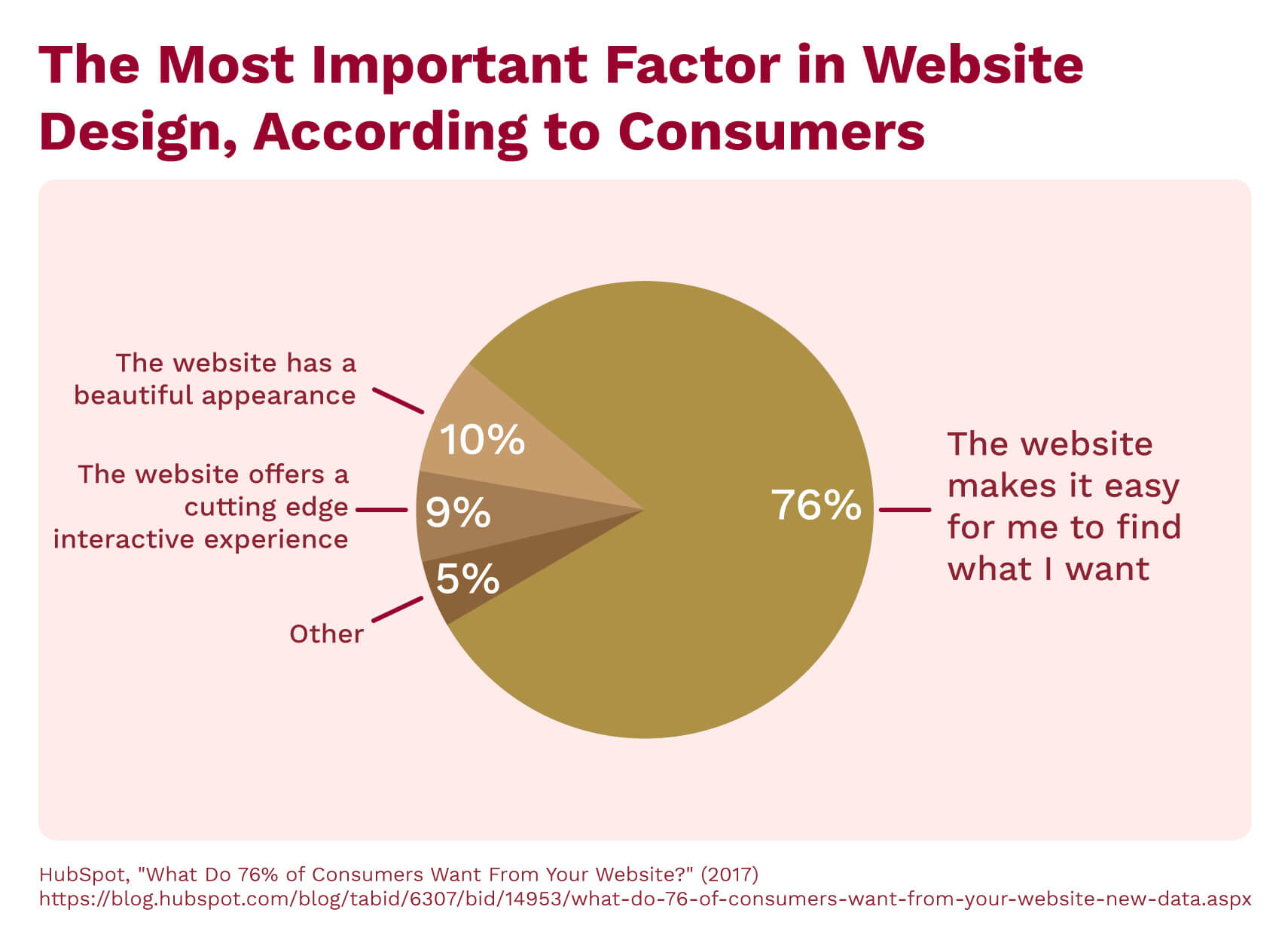
That said, odd layouts, unique content structuring, and animated elements can make a site tiresome to navigate. According to HubSpot, a full 76 percent of surveyed online visitors believe that a site’s most crucial characteristic is its ease of use. People spend a significant portion of their lives online and can become frustrated or disengaged when oddly designed websites don’t mesh with a visitor’s digital expectations.
And yet, artist sites can often make it difficult to find out how to support the artist, buy their work, or purchase event tickets.
Artists can take a page from museum exhibits’ online guides as inspiration. The best art sites meld unique aesthetics with user-savvy pragmatism. Museums’ site designs typically guide users through a stream of easy-to-read information, highlighting the most important points via stand-out buttons on their landing pages.
Here’s what you can do if you work in the arts.
Wondering what you can do to boost your own studio’s UX? We have a few ideas for you.
- Seek an art-UX balance.
Artists are taught to be experimental. Their priority is to find new and innovative avenues of self-expression that don’t align with mainstream expectations around visual media. This explorative mindset is important from a cultural perspective; however, it can be downright damaging from a UX perspective. While your website should display your artistic sensibilities, aesthetics should never come at the cost of usability. - Ask a non-artist to review your website.
If you want to establish an online presence for your studio, try asking a non-artist friend to review your site. They can help ensure that your website balances the tightrope between aesthetic expression and functionality.
- Figure out what your visitors are looking for.
This is a tricky challenge. Are your visitors looking for opportunities to view or buy your art? Do they want to find your events schedule? Or are they simply looking for your blog? By finding out what your visitors are searching for when they look for you online, you can design your site to better suit those needs.
Additional Resources
- Make Design Stand Out Without Sacrificing UX — Envato
- What Can a Museum Exhibit Teach Us About UX Design? — InVision
- Is UX an Art, a Science, or Both? — YUJ Designs
Pharmaceuticals
If you’ve ever tuned into cable TV, you’ve seen the ads. You know, the ones that advertise the latest and greatest sleeping pills, allergy medications, or diabetes treatments?
Usually, these crisp videos include idyllic B-roll footage of smiling patients going about their daily lives — working in a garden, spending time with their families, or playing with dogs, for instance. They feature peaceful scenes of a life that you, the viewer, want to live. A slow, warm narration encourages viewers to talk to their doctor about changing their prescription to the advertised product.
But then, at the very end of the ad, the tempo changes. Suddenly, the idyllic images share screen space with a stream of written side effect warnings that scrolls upward faster (and in smaller text) than you can read. This illegible text often comes paired with a drastically different vocal narration, one that reads the risks posed at impossible-to-understand speeds.
If you see pharma ads online, the same problems persist: warnings are included in too-small fonts and made difficult to read by their placement or coloring. Even worse, if patients try to look up a drug’s product description on a pharmaceutical firm’s website, they inevitably find themselves deluged by intimidating scientific terminology. These UX decisions make it nearly impossible for consumers to easily access the information they need to make an informed purchasing decision.
In the pharma field, UX designers should seek to make information simpler, improve text readability, and avoid any promotional messages that could get in the way of providing vital information to decision-making consumers.
Here’s what you can do if you work in pharmaceuticals.
Obviously, the pharmaceutical industry is incredibly expansive and encompasses thousands of job titles. Your ability to influence its UX will depend heavily on the role you play within the sector — however, there are a few common UX tactics you can apply if you work in pharmaceuticals and, in particular, the pharma marketing sector.
- Focus on informational availability.
As we’ve noted above, consumers often struggle to find the information that they need to make an informed decision on advertised drugs. If you can, try to offer ideas for how pharmaceutical companies can extend transparent, easy-to-understand summaries on the products they advertise to uncertain consumers.
- Pitch content that exudes sincerity.
Would you buy a product you couldn’t trust? Most people would answer no. Unfortunately, many pharmaceutical companies make the mistake of speeding past drug side effects during their adverts. While these choices are well-intentioned to avoid boring or scaring the consumer, this tactic inadvertently makes the advertised product seem sketchy. If you work in pharma, try sharing new content ideas that break from the fast-scrolling mold and take a more genuine approach when connecting with consumers!
- Balance marketing goals with consumer needs.
Consumers want drugs that can help them — but they also need resources to help guide them through their choices. If you’re in a client-facing pharmaceutical job, make sure that you are prepared to answer any questions that patients may have about their prescribed medications.
Additional Resources
- Why UX in Pharmaceutical Marketing Sucks — PM 360
- Pharma Marketing for Newbie UX Designers — Medium
- UX of Healthcare and Pharma Websites: Best Practices — InTechnic
Final Thoughts
No industry has perfect UX — but with a little work, we can make the world a more consumer-friendly and functional place!
Take some time today to think of a few small, actionable strategies that you can implement at work. Be the change you want to see in the world; after all, if you don’t start the ball rolling, who will?
Ready to boost your skills and enhance the user experience for your organization’s customers? Visit University of Denver UX/UI Boot Camp to get started!